Overview
CU Explore is an app that is tailored for Cornell students to help them discover campus events, connect with peers, and manage social activities. It promotes genuine connection that leads to a healthier balance between academic and social life.
Challenges Faced by Transfer Students
Transitioning to a new university as a transfer student is both an exciting and challenging experience. Unlike freshmen, transfer students often enter with established academic credits but lack the social networks and familiarity with campus resources that many of their peers have already developed. The pressure to quickly adapt to a new academic environment while building meaningful connections often results in feelings of isolation and stress, making the transfer experience uniquely demanding.
We wanted to learn some about the target users, but before conducting the user interviews, we had some goals/key insights in mind.
Our Research Goals
- Understanding the specific challenges transfer students face in maintaining social connections and integrating into the Cornell community.
- Identifying the primary factors contributing to their difficulty in balancing academics, social life, and mental well-being, particularly how these challenges affect their overall college experience.
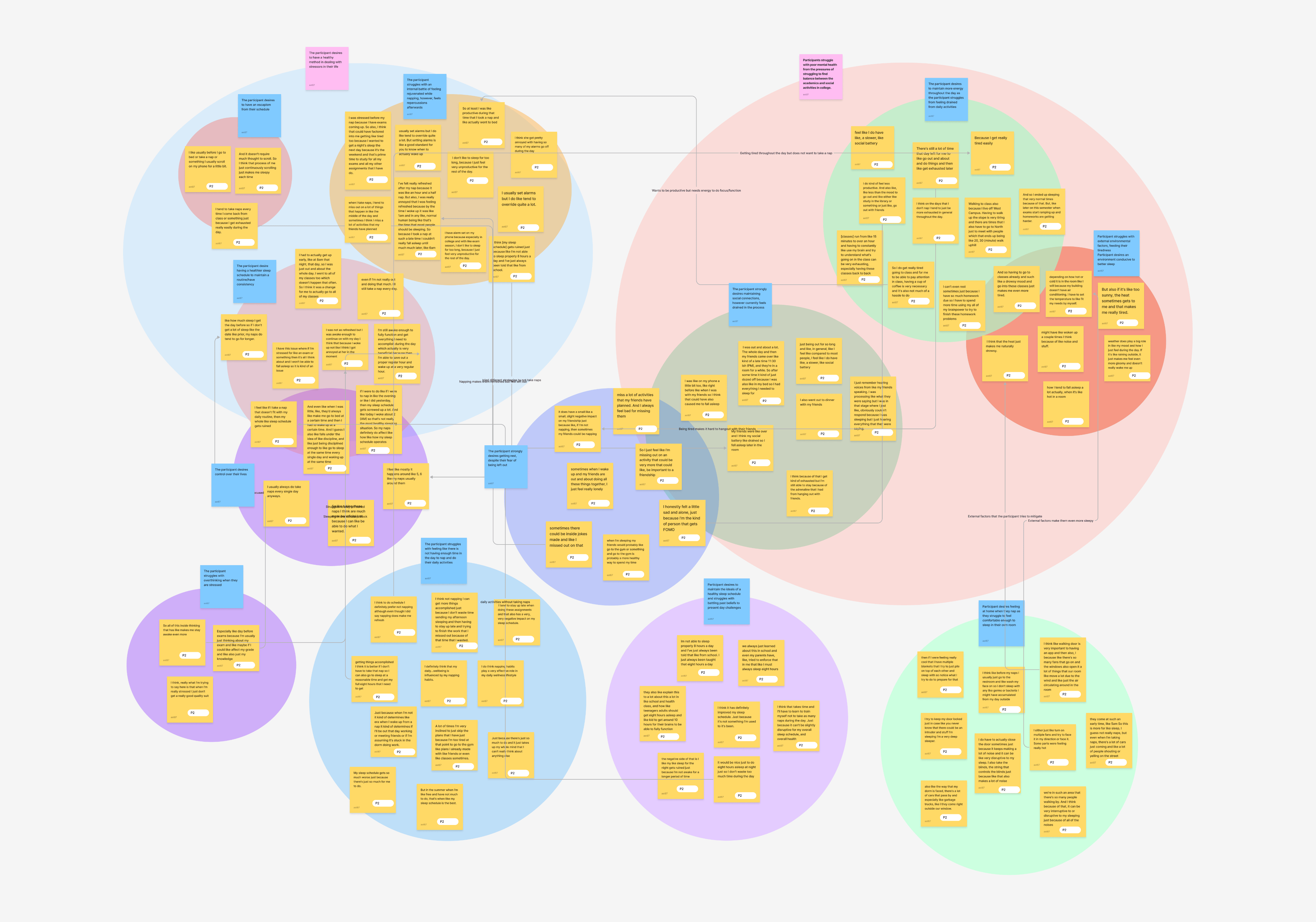
With the six user interviews finished up, it was time to pick apart the transcript to find some underlying struggles and desires. Here is what we found:
- Students struggle to find events and resources → missed opportunities.
- Desire to connect with peers and feel part of the community.
- Stress from managing academics/social life → poor sleep and mental health.
The Problem
Cornell transfer students often struggle with navigating the vast array of campus resources and events, which hampers their ability to establish meaningful social connections. This challenge is compounded by the difficulty of balancing a rigorous academic workload with social activities, leading to feelings of isolation, stress, and challenges in maintaining mental well-being. The key challenges identified were:
- Existing resources are confusing: Cornell's campus groups lack easy filtering to find events specific to the user's interests.
- Hard maintaining social connections: Transfer students want to attend events to meet friends they aren’t yet close to, but can only do so if they hear through word of mouth who’s attending.
- Challenges in balancing academic responsibilities with social life, leading to stress and mental health issues.
The Target Audience
Newly transferred undergraduates at Cornell University who need support integrating into the campus environment while managing academic responsibilities and forming social networks.
The Goal
Simplify event discovery, enhance social connections, and help transfer students' balance between academic and social life for a better college experience and well-being.
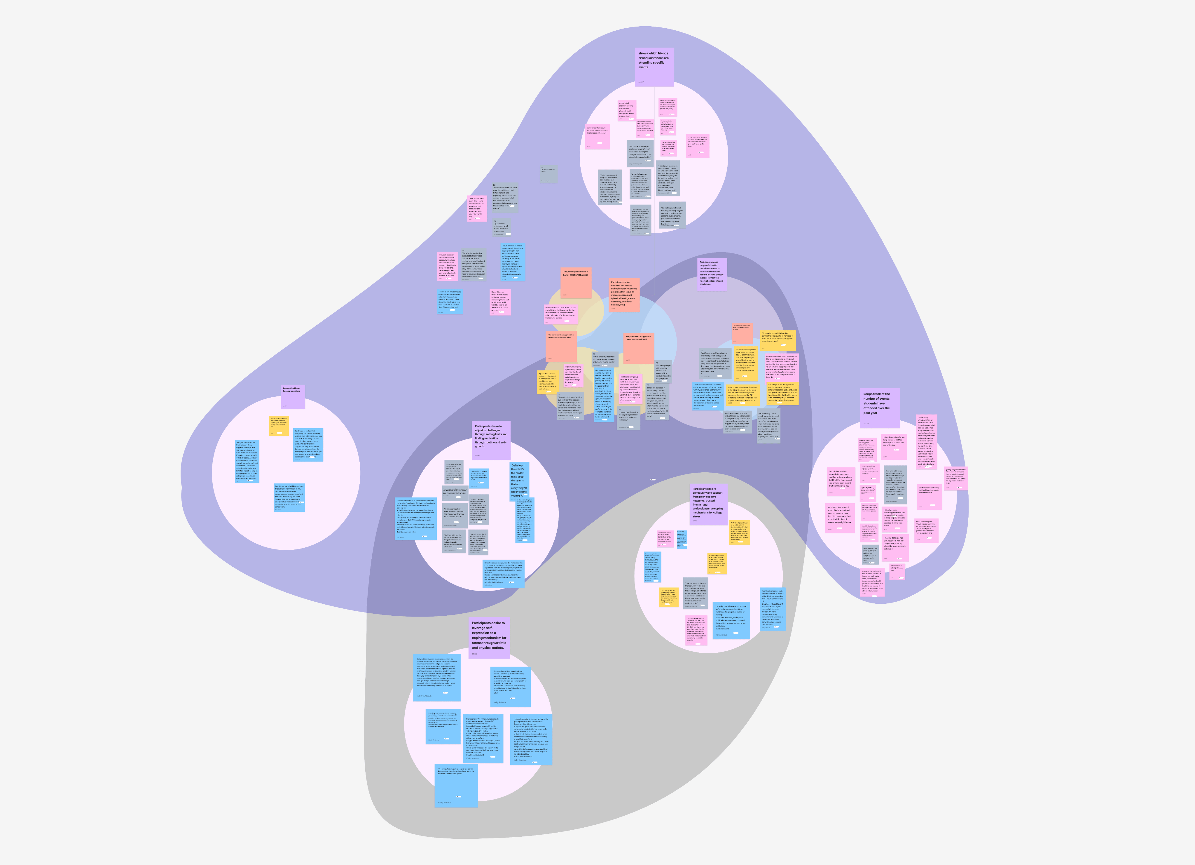
Building on the challenges transfer students face with social integration and event discovery, we developed the following key ideas:
- Social Connection: Allows transfer students to see which friends or acquaintances are attending events, making it easier to plan meet-ups and build connections.
- Personalized Event Recommendations: Tailors event suggestions based on user profiles, fostering a sense of belonging and reducing isolation.
- Event Tracking: Tracks the number of events attended over the past year, encouraging ongoing engagement in campus life.
To arrive at these ideas, we conducted extensive brainstorming sessions, capturing all thoughts and possibilities on paper. Below is an image of our brainstorming process, showcasing the wide range of ideas that were considered and refined to create these final solutions.
Newly transferred undergraduates at Cornell University who need support integrating into the campus environment while managing academic responsibilities and forming social networks.
In the Prototype phase, we translated our ideas into tangible, user-focused designs. This process began with the creation of an Information Architecture map, which laid out the app's structure and user flow, ensuring a logical and seamless experience for transfer students.
.png)
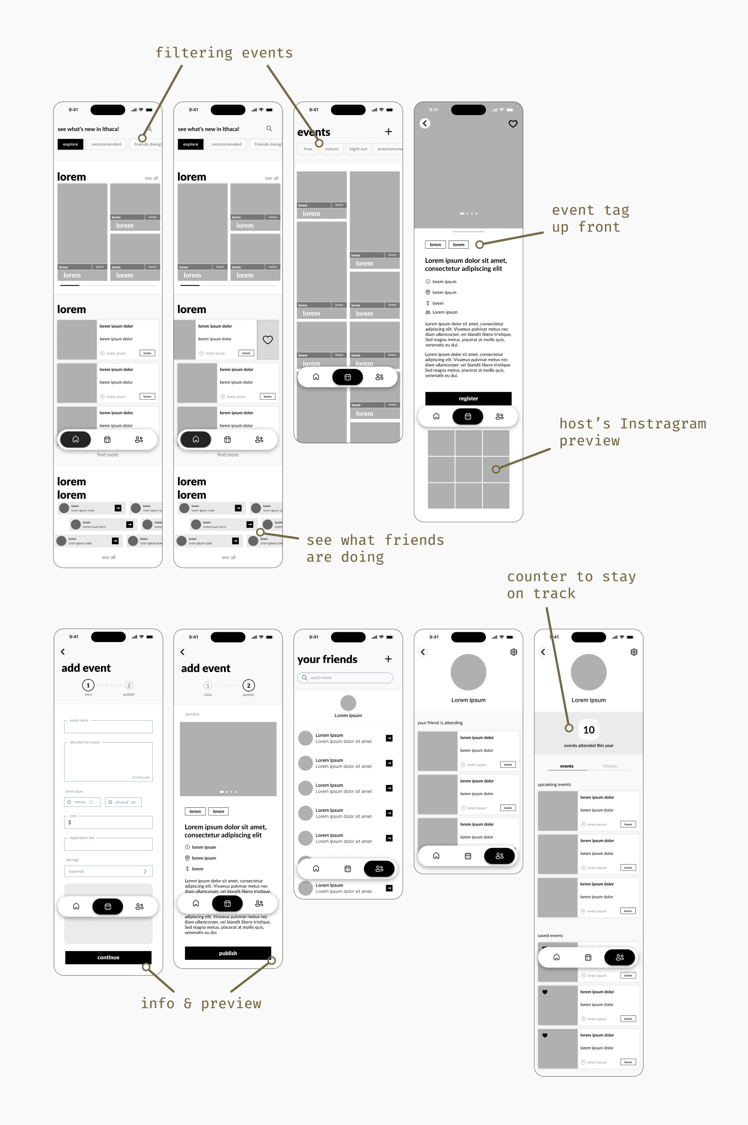
Mid-Fidelity Wireframes:
Starting on the mid-fidelity stage, we focused on refining the core functionalities of the app, translating wireframes into detailed, interactive prototypes. These mid-fidelity designs were crucial in testing the user experience and ensuring that the app's layout, navigation, and key features were intuitive and effective. By focusing on the essentials, we could gather valuable user feedback, which guided the final adjustments before moving on to high-fidelity prototypes.
User Testing Interviews & Feedback:
With the core features in place, we moved forward to validate our designs through user testing. We conducted two rounds of testing, where transfer students interacted with the prototypes and provided crucial feedback. Their insights were needed in refining the design, making sure it met their needs and expectations.
No curve on the cards were confusing.
Users felt the straight edges on the event cards made the interface look too rigid and made it seem like a photo collage instead of clickable event cards to ineract with.
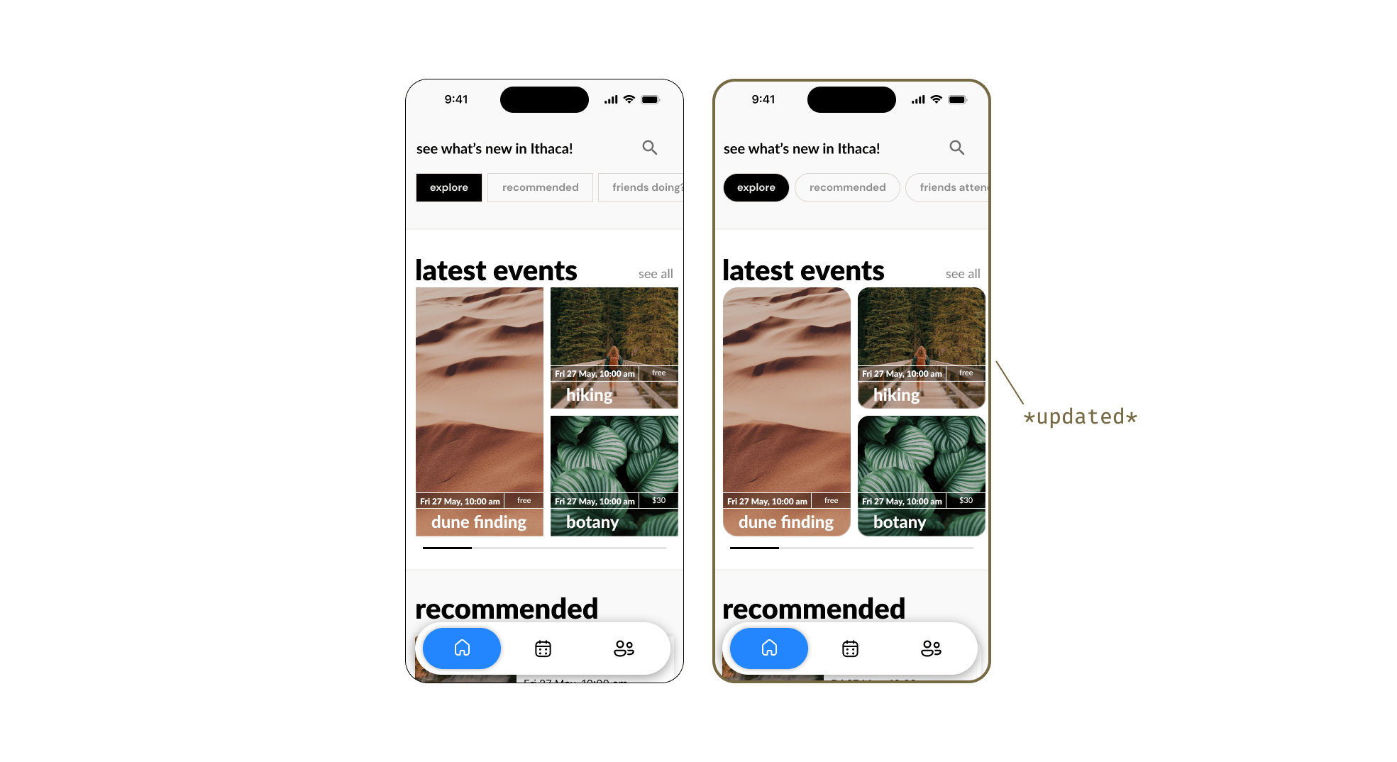
Rounded the edges of buttons and cards to create a softer, more welcoming look, which better resonated with users and improved the overall understanding of the event cards.
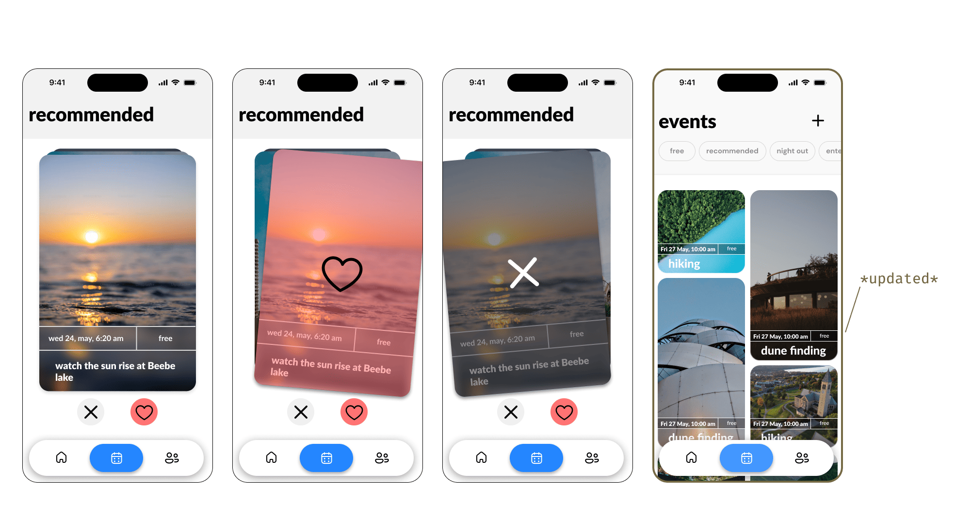
Removing swipe-through cards
The swipe-through card feature for browsing events felt cumbersome, with users finding it time-consuming and overwhelming due to the amount of information on each card.
Removed the swipe feature and replaced it with a recommended simplified list view, allowing users to quickly browse events with clear, concise information, improving user satisfaction.
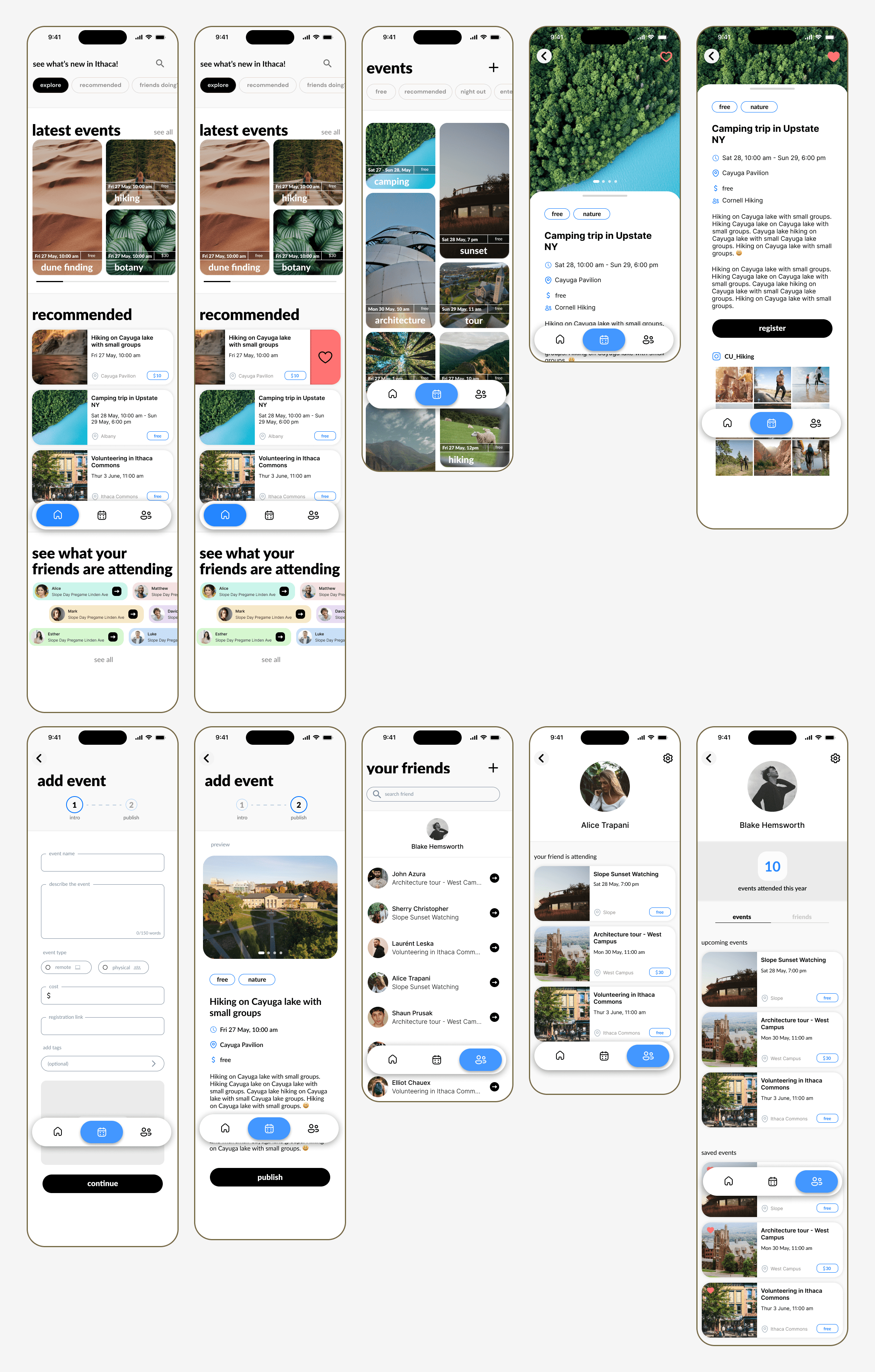
High-Fidelity Wireframes Post-Testing:
After incorporating user feedback and refining the design, I developed a detailed set of high-fidelity wireframes for CU Explore. These wireframes encompassed all critical features, including event discovery, social connection visibility, and event tracking. The focus was on creating an intuitive and visually cohesive interface that fully aligned with the needs of transfer students, ensuring a user-friendly experience across the app.
The testing phase wasn't just about identifying what worked; it was about refining the app to truly meet the needs and expectations of transfer students. Through this iterative process, we developed an app that not only simplifies event discovery and enhances social connections but also engages students in a meaningful and user-friendly way, ultimately improving their campus experience.