Overview
In an era of information overload, TruScoop stands as a solution for users seeking transparent insights into the political leanings of their news. This case study traverses five stages, each step a crucial part of crafting an app designed for clarity and user empowerment.
In the Empathize stage, the objective was to deeply understand the user's experience with news consumption and their awareness of media bias. The goals for the user interviews were:
- Determine if users are aware of and concerned about the political leanings in their news.
- Understand the users' ability to identify the direction of these leanings and the strategies they employ to do so.
- Explore how users attempt to obtain unbiased perspectives on current events.
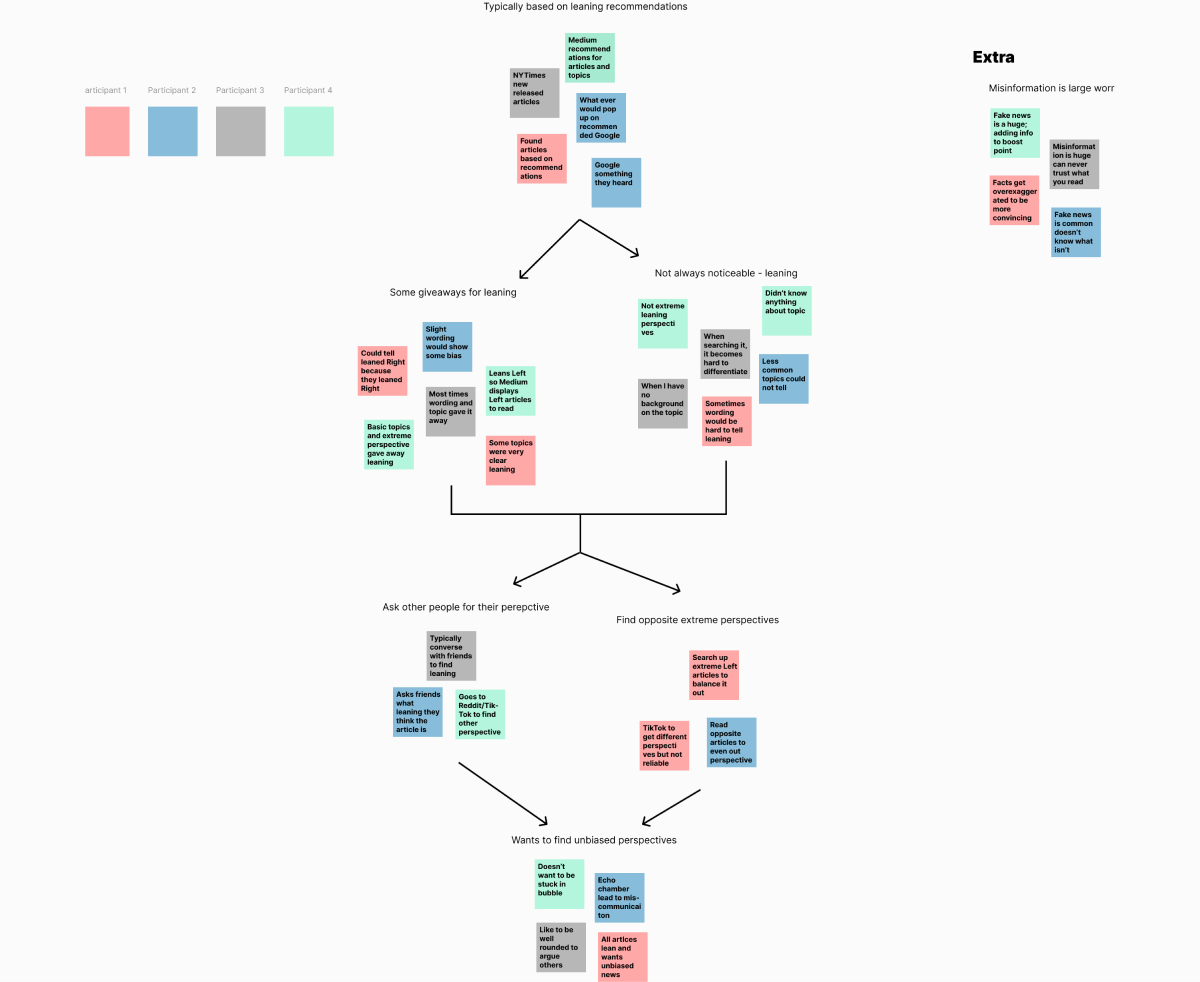
With the six user interviews finished up, it was time to pick apart the transcript to find some underlying struggles and desires. Here is what we found:
- Students struggle to find events and resources → missed opportunities.
- Desire to connect with peers and feel part of the community.
- Stress from managing academics/social life → poor sleep and mental health.
With the six user interviews finished up. Here is what we found:
- Users are often uncertain about the political bias of news articles, making it challenging to trust the content fully.
- Users try to determine the bias by looking for certain keywords and the source.
- There is a clear concern about being trapped in echo chambers, and wanting to a diverse range of perspectives.
- Users look for tools to help them understand the political leaning, indicating a gap in the current news consumption experience.
- Users value transparency and would appreciate a feature that highlights the political leaning of an article.
TL;DR: We conducted user interviews to uncover how people recognize - and struggle with—political bias in news, revealing a need for transparent, easy-to-use bias indicators.
The Problem
Users often face ambiguity in the political stance of news articles, and the absence of an easy method to identify this adds to the challenge. This People Problem reflects the difficulty in accessing unbiased news without a reliable and convenient means to do so. The challenges identified were:
- Ambiguity in Political Bias: The political stance of news articles is not always apparent.
- Lack of Convenient Tools: There is no straightforward mechanism for users to uncover the bias of news articles.
The Target Audience
The user persona created, based on the insights from the Empathize stage, represents the target audience — individuals who are actively seeking to navigate the news with an informed and critical eye.
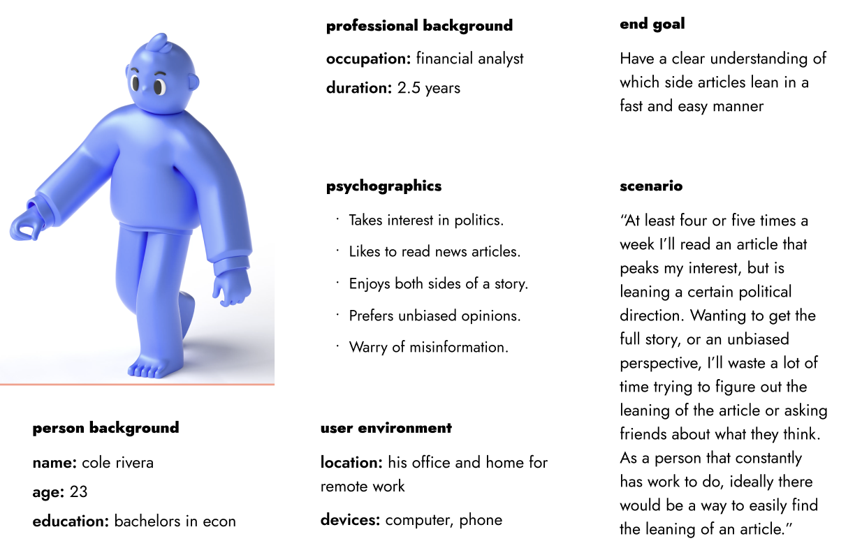
The Goal
To enhance user understanding of news bias and support informed reading by providing clear indicators of political leanings.
TL;DR: We defined the core problem as users’ inability to easily discern news bias and framed our goal to provide clear, convenient tools for revealing an article’s political stance.
Drawing on the insights gathered from users, my friends and I went on a brainstorming session aimed at enhancing and redefining the solutions that users were already employing.
Here is an image of a few of the brainstorming ideas:
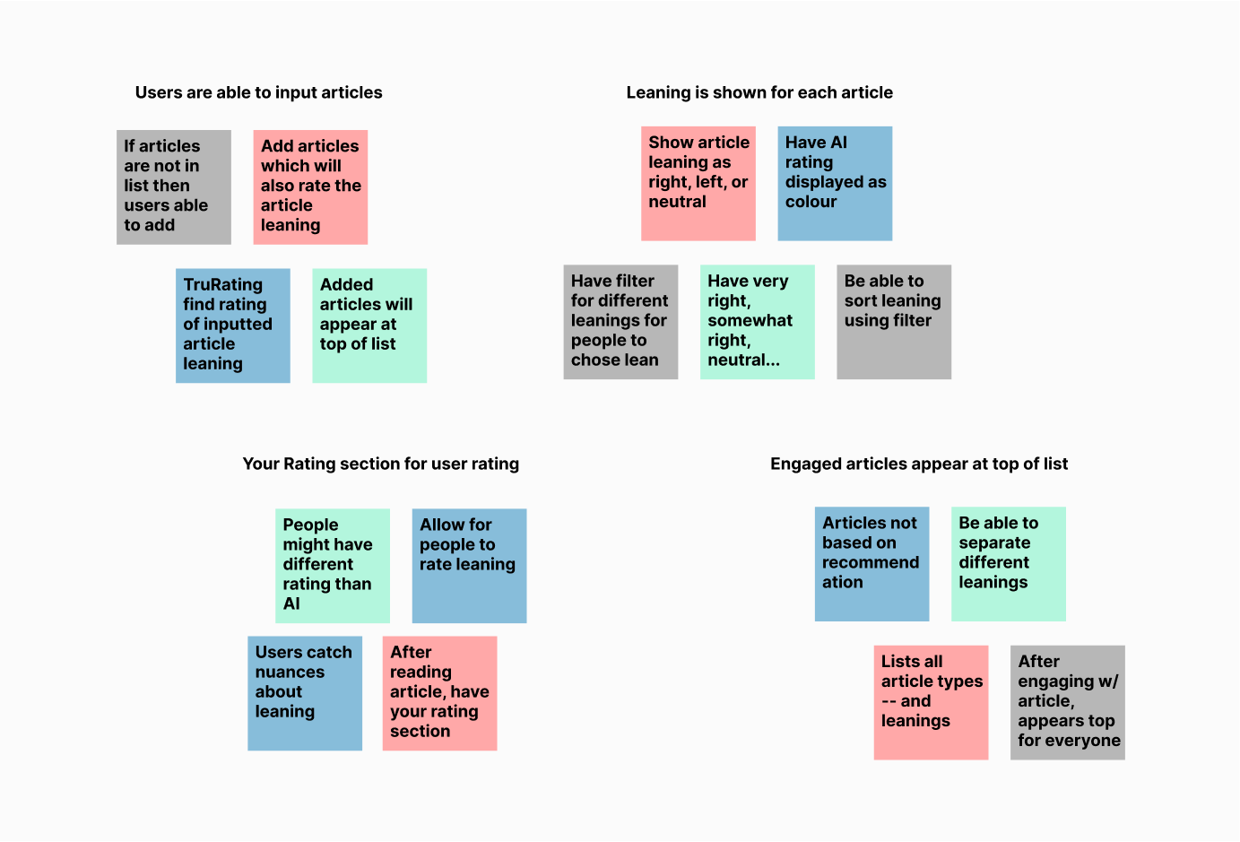
The ideation stage involved collaborative brainstorming, leading to the concept of the "trurating" system—an algorithmic feature categorizing news articles on a political spectrum. A complementary "user rating" function was also conceived, enabling readers to contribute their perspectives.
TL;DR: Through collaborative brainstorming, we conceived the “TruRating” algorithm plus a community rating feature to map articles on a political spectrum and let readers contribute their perspectives.
Moving from ideas to concrete designs, the prototyping phase was a crucial step in bringing the TruScoop app to life. This stage involved developing wireframes that visually guided the app's structure and user interactions.
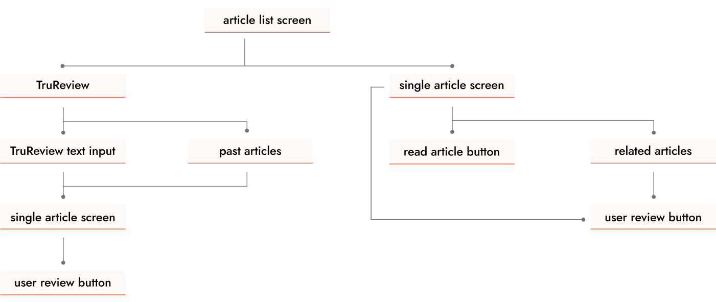
Mid-Fidelity Wireframes:
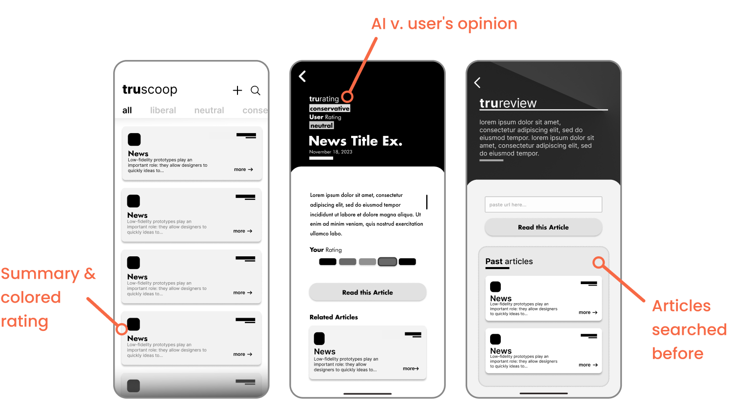
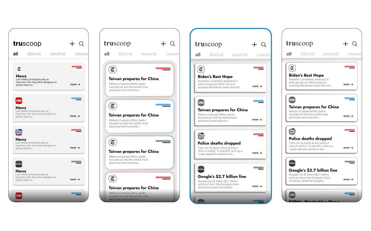
With our roadmap in hand, we moved on to the mid-fidelity wireframes. Think of these as the blueprint of TruScoop, where we start seeing how the app will look and feel, but without all the finer design details. Key features at this stage included:
- An intuitive interface for browsing articles, making it easy for users to explore content.
- The TruRating display, giving a visual snapshot of the article's political bias.
- User input sections for ratings, encouraging community interaction and personal contributions.
These mid-fidelity wireframes were crucial in shaping the basic structure and functionality of the app, focusing on the user experience and flow.
TL;DR: We built mid-fidelity wireframes showcasing an intuitive article browser, visible TruRating displays, and in-app rating controls to establish the app’s look and feel.
The Testing phase was where TruScoop really started to take shape based on real user feedback. This stage was all about ensuring the app not only looked good on paper but also worked well in the hands of our users.
User Testing Interviews & Feedback:
We kicked off with user testing interviews. This was our chance to see how real users interacted with our prototypes. We listened to their feedback and took note of any stumbling blocks they encountered. We found that the design we liked was not the same design the users liked — we started to reimagine the experience. Here were some problems and iterations we made to fix it:
Not enough contrast and confusion with the grey color
Grey made it hard to read the summary and made it seem as though the article was already read.
We went with the third design, since users found it to be the most professional and trustworthy design. I originally was designing this based on 90s retro vibes, NYTimes news paper look.
Order of article and rating button didn’t make sense
It would make more sense for the "Read the Article" button to be above your rating -- users should read the article before voting
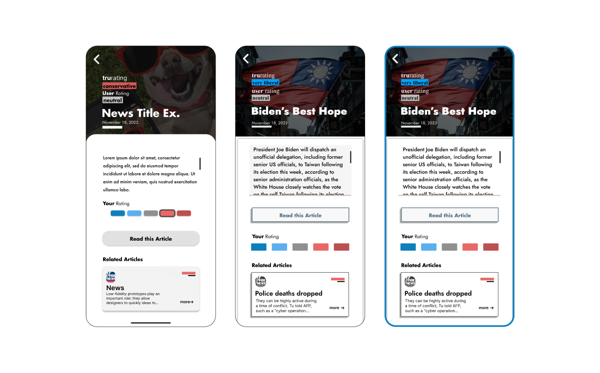
I tried to keep the new theme that I decided on then also changed the order of the button and the rating. I made the “your rating” button bigger and more spread out to help with accessing the button.
High-Fidelity Wireframes:
After implementing these changes, I updated our high-fidelity wireframes. These now reflected a more polished version of TruScoop, incorporating all the insights and suggestions from our user testing phase. The interface was not only more visually appealing but also more functional and user-centric.
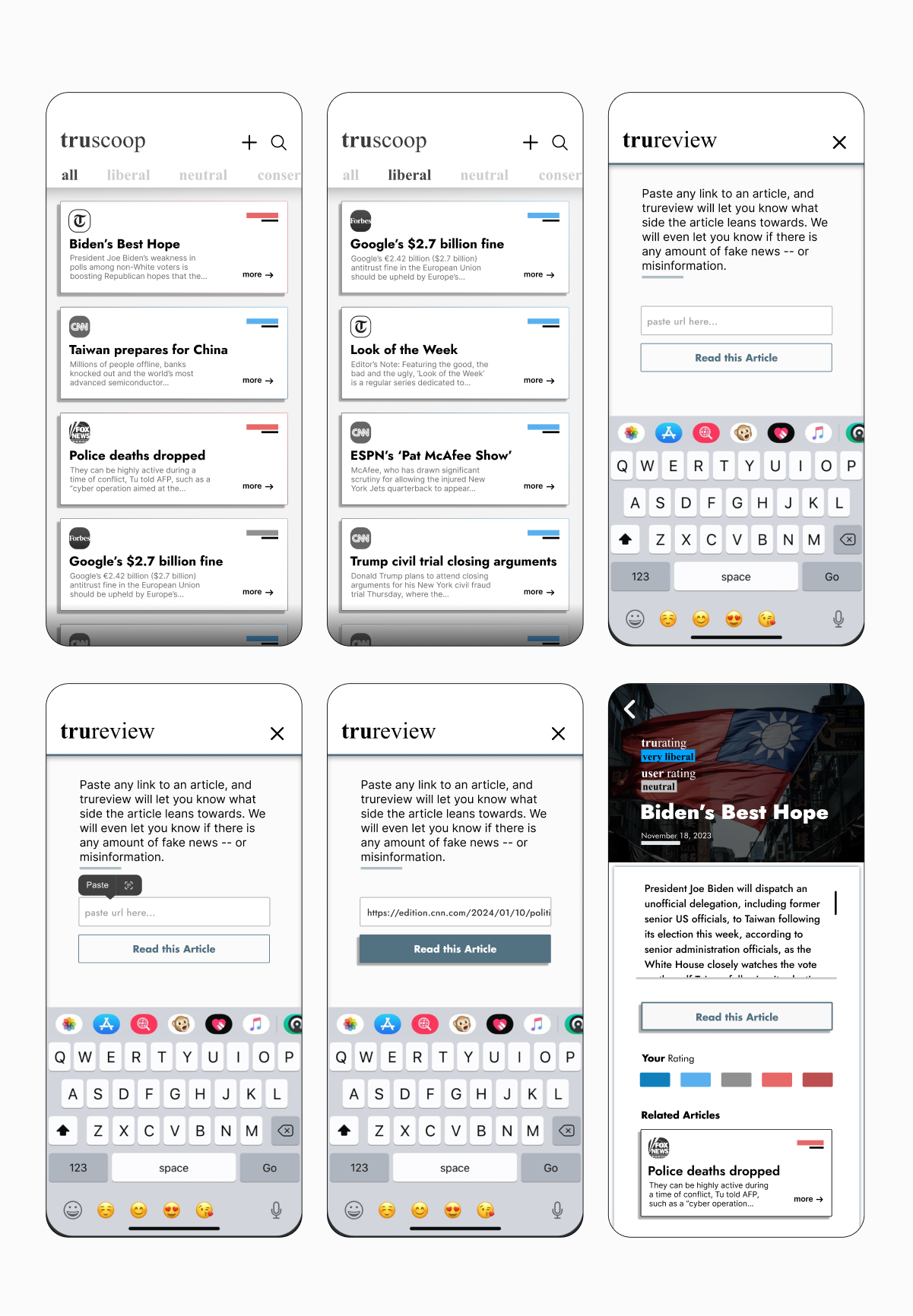
The final design phase was where everything came together. I want to ensured that the app was not just a tool but an experience - engaging, informative, and easy to use.
TL;DR: User testing highlighted readability and button-order issues, which we fixed by improving contrast and reordering elements, then polished into high-fidelity designs that users found professional and trustworthy.